Stream responsibility
Led design across most credit-card initiatives and kept individual changes connected as one journey.
MTS Fintech · Credit-card stream · 2024
In 2024 I led design across most of MTS Fintech’s credit-card stream. I worked closely with product, analytics, research, engineering, and partner teams—from discovery through launch and iteration—and joined the core MTS → MTS Dengi transition team.
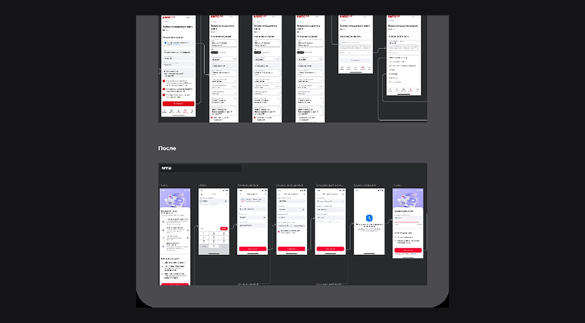
Rebuilt the application journey with the team: form structure, errors, delivery, and final states.
Twenty-one fields, repeated input, and unclear progress caused errors and drop-off.
+17% conversion, 21 → 12 fields, and −43% cognitive load.
My role in the team
A credit card is more than one form. Acquisition, customer data, checks, delivery, errors, and final states all belong to one journey, built by product, analytics, research, engineering, and partner teams.
Led design across most credit-card initiatives and kept individual changes connected as one journey.
Worked from research and journey logic through UI, development handoff, and post-launch review.
Contributed to the MTS → MTS Dengi transition alongside the core product team.
Helped the team balance regulation, deadlines, legacy decisions, and new business needs in one clear experience.
Problem
Identity data, consent, risk checks, delivery, regulation, and internal business logic had accumulated into a long questionnaire with duplicated fields, UX debt, and weak progress feedback.
What we changed
I mapped the full journey and found where people left, repeated information, or lost track of the next step.
Together with product and analytics, we separated journeys for different customer states.
I rebuilt the application into clear stages and made progress visible.
The team treated errors, delivery, and final states as a proper part of the journey.
We ran eight usability tests and refined the prototypes before launch.
Outcome
Source design
Below is the working design at source quality. Open Figma to zoom into any area.
Ozon Tech · Loyalty · Cross-domain