
Ozon Tech · PDP · 2024–2025
Making the product page easier to understand
A product page should help people understand the offer and buy. My task was to fit new commercial mechanics in without letting the main job disappear among the modules.
Reworked PDP hierarchy and the rules for new commercial modules.
The page kept growing while decision-critical information got lost among modules.
Users reached a decision 1.5× faster.
Problem
The page kept growing more complex.
Promotions, recommendations, and commercial modules kept appearing on the PDP. The main task still had to stay clear: understand the product, compare the offer, and buy.
What we changed
Kept the main task clear: understand and buy.
- 01
First check whether a new module helps people choose and buy.
- 02
Solve similar needs with one clear pattern instead of one-off modules.
- 03
Make room for commercial goals without hiding essential product information.
- 04
Keep the hierarchy clear with every new launch.
- 05
Design with engineering and account for the product’s next changes.
Outcome
Time to decision became 1.5× faster.
Designs
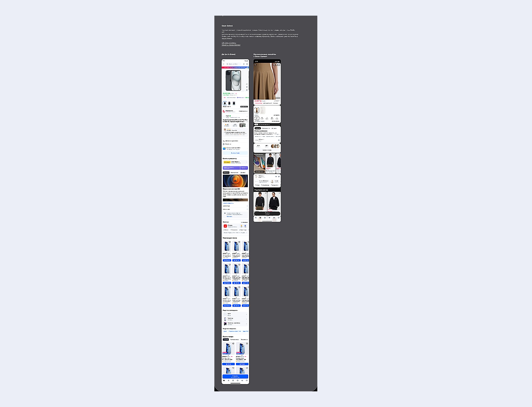
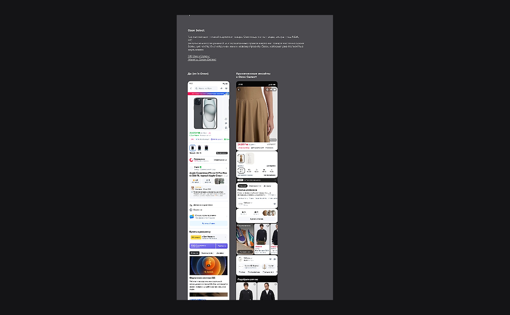
Working PDP screens.
Below are real product designs at source quality. The case copy stays as readable page text.
Otkritie Bank · Mobile fintech